Case Study
implementing an e-commerce platform
Concept Project
Objective: Re-design a local company's website to incorporate an e-commerce platform while meeting the goals of the user, business, and brand.
What I did: UX/UI Design, Research, User Interviews, Card Sorting, Information Architecture, Wireframing, User Testing, Prototyping
Tools used: Surveys/Interviews, Heuristic Evaluation, Comparative & Competitive Analysis, Card Sorting, Taxonomy, Axure, User Testing
Jump to any part of my design process:


The Challenge
“We live by the South Austin, Texas way of life and the belief that a hand shake still seals the deal.”
Rock N' Dirt Yard is a landscaping company in Austin, Texas. The company aims to provide great bulk deal pricing on quality dirt, rock, and grass, relying on value for repeat customers.
While well known in their community, Rock N' Dirt Yard doesn't feature an online shopping experience, making it difficult for customers to purchase products.
My goal was to implement an e-commerce platform for users to navigate, locate, and purchase products easily.
The design would need to have an efficient means for purchasing one or more products, incorporate an effective information architecture strategy, and maintain consistency within the existing brand.

Discovery & User Research
I researched the current website, discovering how users could interact and locate products, branding/details that would need to be retained, their competition and how the site compared to those in the same market.

Rock N' Dirt Yard website.

Rock N' Dirt Yard pricing PDF.
Competitive and comparative analysis between Rock N' Dirt Yard, Lowe's, Austin Native Landscaping, and ABC Home and Landscaping.
My research showed that while the site offered a large number of products, the navigation and information architecture were poor, making it difficult for users to locate and learn more about products offered. Users had to browse items via a single PDF, with unnecessary repeat listings for several products.
Competitive and comparative analysis of other landscaping companies revealed that stores of similar size were geared more towards customers coming into the store, with larger stores like Home Depot and Lowe's providing opportunities to purchase items both in store and online.
Taxonomy was important for this project due to the sheer volume of products available for sale. It was important to categorize products in groupings that would be intuitive and informative for the user, for example rock products listed in a separate category to mulch.
I created a card sort to analyze where users were most likely to place a variety of landscaping supplies, including different types of rock, mulch, grass, and dirt.
Making sure products were categorized accurately would be a key component to a successful user experience.
Card sorting activity done through Optimal Workshop.

Target User: Creating Personas
I conducted user interviews to gain insight into what information would need to be included in the redesign, and how best we could keep our user in mind during the design process.
Key points included:
Users need detailed product descriptions and clear pricing so they know what they're purchasing.
The users needs to be able to trust the business.
Novice gardeners rely on the reviews of others.
Clear photos and options to see how a particular product is used.
A primary persona was formed: Elaine.

Elaine, Primary user
Gardening enthusiast
Cares about the experience and personal connection.
Needs
Feeling of relationship with the brand.
To understand the products.
Reviews from others to know what works.
Pain points
Lack of sufficient product descriptions.
Having no person to talk to.

Ideate
With Elaine in mind, how could we streamline the product selection process without losing her trust in a quality product? I focused on showcasing product details and descriptions, and quick, easy navigation.
Coffee and La Croix, essential to the design process.
Early product page layout.

Design
After brainstorming and ideating on sketches, I decided to trim the site down to a minimal number of pages. Users would be able to a) search for products directly from the home page using photographic navigation, b) use primary navigation tools to navigate, or c) browse items based on a featured garden and the products used. Like products would be combined to a single page, with a single interaction to flip between items and their descriptions.
Sitemap version 1: tackling the chaos.
Sitemap version 2: on my way to simplifying.
Sitemap version 3: order forming.
Final sitemap for the redesigned Rock N' Dirt Yard site with e-commerce platform.
Individual pages in the redesign were sketched out.
Home page with featured garden and primary navigation.
Product page with photo navigation.
Shopping cart.
Medium fidelity wireframes were created.
Home page with featured garden, photographic navigation, primary navigation at top and footer navigation for contact details and customer support.
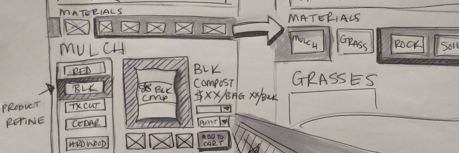
Product selection page. Users can toggle between categories using the horizontal navigation (rock, grass, mulch, soil, sand, misc), then select a particular item from the vertical menu on the left.
Shopping cart page. selected items populate here, with the option to increase the amount or completely remove from cart. Users are prompted to select shipping before continuing to check out.

User Testing
Prototype testing had positive results, with users reacting favorably to the detailed product pages and new checkout process. Several iterations were made:
The header was made smaller to allow for more button space and higher visibility.
The shipping selection arrow was moved to better direct the user, keeping the checkout button greyed out till a shipping option is selected.
The category selection slider was reinforced visually to better show the user what item is selected.

Header version 1.

Header version 2.

Header version 3.

Conclusions and Looking Forward
Rock N' Dirt Yard seeks to provide not only a quality product, but great customer service. Redesigning the site to include an e-commerce platform allows them to focus on giving their customers the service they provide in store, online.
By restructuring content and using image navigation tools, Elaine and other users can efficiently browse the Rock N Dirt Yard website with ease. Detailed descriptions and links to user reviews give her reassurance that she can trust the product and be confident in her selection.
Future iterations could expand more into focusing on a contractor persona for bulk buy purchases and commercial revenue.